

ARTDECK
A marketplace to sell rare authentic tribal arts from India

Responsive website, UI/UX Design / Research / Product Strategy

I designed an experience where users can explore the artwork in their room and make a stress-free purchase.
DURATION
6 weeks
MY ROLE
Sole UX / UI designer
SCOPE AND CHALLANGES
An attempt to improve users' engagement with artdeck. The goal is to increase customer conversion rate and retainment in the marketplace.
This was an open-ended project I did for my UX/UI Course. I made a hypothetical company ARTDECK. The data shows that 70% of users who place artwork in the cart do not checkout, and 50% of users open on average of 5 item pages and abandon the site.
TOOLS

BACKGROUND
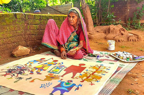
Tribal arts depict mythological tales, scenes from daily lives, and folklore. They are made from organic and natural products. Some tribal arts like ‘Warli,’ ‘Madhubani’, and ‘Gond’ are passed on from generation to generation. Indian tribes sell their artwork to visitors in small galleries near their villages.
During COVID all sales can only be done through their e-commerce websites. There is a need to enhance the browsing and checkout experience of buyers to greatly improve sales on the site.


ARTDECK
A market place to buy authentic tribal arts with confidence and trust.
HOW IT WORKS
INTRODUCTION
A strong introduction to tribes of India can attract buyers' attention. By clicking 'Explore Artwork,' the buyer can find out about the artwork's culture, history, and techniques. Having proper information about the uniqueness of work provides a head start to the website.
VIEW IN ROOM
Buying artwork is challenging because the buyer needs to know how it will look in their room. To get a better visual idea, I added a way to upload the picture of the room and see the artwork on it. Also, some images to see it in various settings could be helpful.
CHECKOUT
People don't like to provide too much information about themselves. I made clear four steps checkout with minimal information. Making an account is optional.
SUCCESS GOAL
Framework

Develop a framework where users can identify and decide the best artwork for their home.
Efficient checkout

Provide guest checkout options for an agile and efficient checkout.
Build trust

Build user confidence, trust, and credibility to retain them for future purchases.
UX PROCESS

RESEARCH
Competitive Research
I started by looking at the currently existing framework and compared a couple of online art galleries regarding design layouts, UI elements, user flows, and functionalities.
KEY FINDINGS
It is always better to show more information about the product, which can be organized by following visual hierarchy and proximity design rules. Design should offer the users freedom and consistent, recognizable flows to reduce cognitive load.
Menu

The top menu provides efficient navigation, and the left menu is only needed if there is a large amount of content to display.
Guest

Guest checkout options are available on most of the sites.
Filter

I noticed that a good filter option could save browsing time significantly by displaying the relevant items.
Reviews

Rates and reviews of items are an essential element on all sites.

Interviews
After interviewing three candidates, I made a list of the core customer needs to have a good art shopping experience on the internet.


KEY NOTES FROM RESEARCH
Below is the summary from research and interview
Extensive Filter and top Search Bar
Having the right filter menus and a top search bar can save time and frustration of people.
Information about art and artist
Buyers prefer to know details about artwork and artists. Similar works from artist, a biography, and story behind the creation will get buyers' attention.
Certificate of Authentication
People want to make sure they buy authentic work from the artist online.
Free shipping
Having not to pay for shipping promotes the buyer to finish the purchase.
Return policy
Having an option to return the item is important for buyers.
Seamless checkout
Guest check out and clear steps to complete the process add towards better user ecperience.
SYNTHESIS
Persona
In order to understand our users better, I developed the following persona using the data from the interviewees. It helped me to stay in their shoes while designing the product.

User flow
After synthesizing the information I have collected during secondary research and interviews, I outlined the factors that lead to an enjoyable user experience.
I created a user flow to identify all the steps a user will go through to view artwork and complete the checkout process on ARTDECK.

User stories
As a user, I want to make sure the artwork looks good in my room so that I will be satisfied with my purchase.
As a user, I don't want to spend too much time looking for the item so that I can have been more productive in my search
As a user, I want to know the return policy before placing the order so that I can return it in case it does not work out for me.
As a user, I want to purchase genuine and authentic goods so that I can build credibility and trust with the store
As a user, I don't want to make an account so that I can keep my personal information private.
As a user, I want to explore more items before checking out so that I can compare and make up my mind.
DESIGN
Low fidelity
Initially, I sketched some screens in Figma with basic functionality and layouts keeping key points in the design center.
MAIN PAGES
LANDING PAGE
An introduction to the tribe's history of artwork and techniques.
GALLERY PAGE
Thumbnails of artwork and filter on the right.
DESCRIPTION PAGE
Details of a particular artwork.

CHECKOUT PAGES
Then I designed a straightforward checkout process using four screens.
CART PAGE
Option to choose shipping methods and an invoice of the order.
ADDRESS FORM
Billing and delivery address with an option to create an account.
PAYMENT PAGE
Credit card or PayPal patent options, additional information text area.
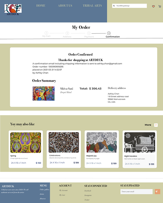
CONFIRMATION PAGE
An order confirmation with an email was sent to notify the order summary.

VIEW IN YOUR ROOM PAGES
I wanted the user to identify the right artwork for the room, and with that central idea, I designed the flow below to view the painting in the room.
UPLOAD IMAGE
Upload an image of your room to view artwork in it

CONFIRM UPLOAD
User can change the image in the case made a mistake

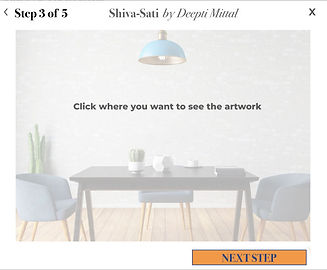
SELECT A PLACE
Click on the wall where the user would like to see the artwork.
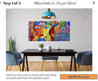
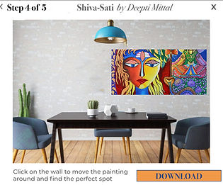
EXPLORE OTHER PLACES
Move the rectangle around to explore the right fit for painting

DOWNLOAD IMAGE
When we display the artwork at the perfect spot, download the image


HIGH FIDELITY
After testing low fidelity sketches, I implemented the study guide and created the following high fidelity wireframes for desktop and responsive web mobile versions. While designing these screens, I used the takeaways from the first usability testing.
VIEW IN THE ROOM
Findings from Testing
‘Choose a place on the wall’ page can be removed.
After some time, the popup page should close on its own at the ‘view in my room’ process is over with this screen.
Add back button on the popups at ‘view my room’ screens
Add ‘Add to cart’ option at pop page 'view in my room.’
UPLOAD IMAGE
Upload an image of your room to view artwork on the wall of your room
CONFIRM UPLOAD
Users can change the image in case they made a mistake or want to try different room
SELECT PLACE
Find an area to view the artwork by clicking on the wall.


FIND THE PERFECT SPOT
Move image at the center to explore how it looks at this spot

FIND THE PERFECT SPOT
Move image at center to explore how it looks at this spot
FIND THE PERFECT SPOT
Move image at right to explore how it looks at this spot
DOWNLOAD IMAGE
After deciding the right place to display artwork, download the picture for future reference.
DOWNLOAD IMAGE
After deciding the right place to display artwork, download the picture for future reference.
DOWNLOAD IMAGE
After deciding the right place to display artwork, download the picture for future reference.


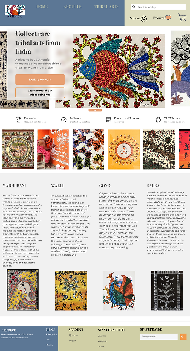
HOME PAGE
Findings from Testing
Add more info about each artwork and tribe more visually.
Make a consistent style menu on the top nav.
DESKTOP
Clear CTA's on the Hero image. Introduction of tribes and their artwork. Top nav menu and bottom footer. Images from the artwork
MOBILE
Menu, Description of artwork, CTA, and footer menu
GALLERY PAGE
Findings from Testing
When clicked on a tribe, it takes the user to the artworks painted by that tribe. Paintings are displayed in a grid style, and users can see the size and the name of the artist under the artwork.
DESKTOP
Extensive filter menu, users can go back on clicking the top nav menu or search the artwork.

MOBILE
Extensive filter menu, images are displayed in a grid format.
ARTWORK DESCRIPTION PAGE
Findings from Testing
Shipping cost and delivery text is confusing
‘View in room’ option should be more highlighted
Add certificate and artist signature
Add a back button on the description page
DESKTOP
Description of artwork, art work can be seen in many ways. View in your room will take user to see the work on thier wall. Shipping, delivery, return, and gaurentee policy is written here.
MOBILE
Option to see an image in various setting like slide show and all the information as on desktop version.

CHECKOUT PAGE
Findings from Testing
Add tax to the total price.
Ask for zip code or country and inform the user of the shipping cost on the description page.
Add terms and conditions and return policy on the checkout page.
DESKTOP
In the cart, the user can see price, details, shipping options and can proceed to the payment form here.

MOBILE
The cart to proceed to payment before checking out the items.
DESKTOP
In the second step of the checkout process, the user can add an address and make an account.

MOBILE
Responsive version for the second step of the checkout process
DESKTOP
The third step of checkout for adding payment information. USer can recheck all the previously added information like price, address, and add any additional details. They are supposed to accept terms and conditions by placing the order.
MOBILE
Payment Page at the checkout process

DESKTOP
Once an order is placed, the user will be directed to a confirmation page with the order number and details.
MOBILE
Order confirmation page
TESTING
I prototyped the above screens and tested them with five users.
Usability testing one
I conducted usability testing to validate the design solutions by creating specific tasks using our mid-fidelity prototype. The testing aims to observe the behavior of candidates in a moderated testing environment while completing the tasks.
PARTICIPANTS
5
AGE GROUP
18-55 years
LIKES E-SHOPPING
5
OWNS ROOM OR HOME
5
TOTAL TIME
30 mins
FINDINGS
Overall Satisfaction
3.5/5
Completion of task
4/5
Pleasing UI
5/5
Ease to use
4/5
Relevent content
4/5
KEY TAKEAWAYS
First impression
Having the right filter menus and a top search bar can save time and frustration of people.
Terminology/ UI elements/ Icons
Text is consistent with other websites, and icons were easy to recognize. CTA buttons were easy to find and captured the user's attention. Filter options were relevant to list items and helpful.
Checkout process
Users found it very intuitive, easy to follow, and in a standard format. They liked that there was no requirement to sign up for checkout.
What do you like/ dislike?
Explore artwork task
Users liked the way artwork can be seen in different forms. They suggested adding a zoom function for better viewing of the work.
View painting in your room task
Most of the users finished the task smoothly. Some were a little confused and hesitated on some screens. The pattern of interaction was analyzed after the testing by rewatching the recording.
Overall
Users liked the ease of hassle-free navigation. Most users did not scroll down the homepage to see more information about tribal arts even though they would like to know more about tribes and their techniques. CTA buttons in popup windows for the ‘view in the room’ page should be consistent
TESTING ROUND 2
I prototyped the above screens and tested them with 5 users.
I conducted a second round of testing to improve the overall usability and flow of the website. Users were asked to explore the website how they do it in day-to-day shopping and buy the artwork. The aim is to find out what further improvements can enhance the user experience.
FINDINGS
Overall Satisfaction
4/5
Completion of task
5/5
Pleasing UI
5/5
Ease to use
5/5
Relevant content
4/5
KEY TAKEAWAYS
Summary
All the users managed to complete all the tasks swiftly. Some were confused at the home page when scrolling down the page. They were not sure what the graphics and text meant. At the Madhubani art gallery, some users were not sure what to expect from this tribe artwork. Delivery and shipping methods were confusing to understand.
They wanted to learn more about the artist and browse some more work by the artist. The checkout process was smooth for all the users. They felt it was intuitive and standard like all e-commerce websites. The only thing they did not notice was that they were accepting the terms and conditions. Also, some participants had problems going back and forth at the checkout process.
NEXT STEPS
I iterated the current version by applying the key takeaways from the usability testing.
Iterated High fidelity Wireframes
I applied key takeaways from the usability testing two and amended the current pages into the below screens.
LANDING PAGE
I redesigned the landing page to have a better visual way to display tribals and their art techniques. I changed the top nav, footer, and switched to a single CTA button.
FINDINGS FROM TESTING
Add header before tribal art introduction because some users were confused about the content written there box has an overwhelming background.
Reduce the visibility of the background graphics.
Remove image carousel Reduce text in the section ‘description of tribes.’
Link tribe description to the artwork.
Make the size of the shopping cart consistent with other icons.
Keep all icons on the top and the search button at the bottom.
Reduce the text to max two words on the CTA button at the hero image.
Reduce further the number of steps to in the ‘View in my room’ process.
Add ‘ADD IN CART’ option on step 5 page.

ART GALLERY
For the gallery page, I redesigned the filters and changed the layout.
FINDING FROM THE TESTING
Added the route to the page and a better way to navigate to different pages at the end of the page.

ARTWORK DESCRIPTION
I redesigned the detail page by adding information about the artist and artwork from the artist. I made sure customers read shipping, certification, and return information before adding an item to the cart.
FINDINGS FROM TESTING
Add artist information so it will be helpful for users to learn about the artist’s biography before buying the artwork.
Add ‘More work from the Artist’ to explore more work from the artist.
Simplify delivery and shipping methods and options.
Remove the ‘add cart’ confirmation popup window.

OVERALL UPDATED PAGES
FINDINGS FROM TESTING
Overall - add white space
Components in breadcrumbs should be linked to different steps of the process.
Add a checkbox before terms and conditions and a link to a detailed terms and conditions policy page.
Add return policy at the final checkout page.
Add print and back buttons at the checkout process.
Change Italic font to normal on the checkout page to avoid confusion.
Remove the bitcoin option for payment.
The filled text should stand out from not filled text at various text boxes in the form.

FINAL PROTOTYPE
Mobile Prototype
Below is the prototype of iterated high fidelity wireframe
Desktop Prototype
CONCLUSION
While testing the prototypes I can see that the users were satisfied to see the painting in many different ways. They love the idea of uploading the picture of their room and moving the artwork around in it. Also, simple shipping and return policies mentioned on the description page motivated them to make purchases. Most of the customers avoided making an account and having it optional worked better for them. I started with simple designs and amended them after both rounds of testing. Applying direct feedback from the users in iteration contributed greatly to designing a successful product.
Next time when I will be designing a responsive website I would do the mobile web version first because the mobile design is more limited. When we design for a smaller screen we choose only the most important elements into it. It is easier to expand to the desktop version as we already have users' most important elements at the front. It was an amazing experience of discovery and learning while designing ARTDECK.
MORE PROJECTS


