
BINGR
Make Binge Watching Less Stressful.
Mobile UI/UX Design / Research / Branding / Visual Design

I designed an app that can provide people control over what they want to watch on different streaming services.
DURATION
6 Months
MY ROLE
Sole designer responsible for research, design, prototyping, and testing.
SCOPE AND CONSTRAINTS
BINGR is an app where users can get personalized recommendations for shows and movies, build a community, and have a meaningful binge-watching experience.
The project is in the development phase and the BETA version will be released to 100 users.
It's a mobile app for IOS and Android versions.
TOOLS

BACKGROUND
17.8 minutes, on average, browsing possible TV and movie options before selecting something.
- PC Magazine


PROBLEM
We often find ourselves trying hard to recall “Which show did my friend tell me about during the walk?” or “What was the movie my sister saw that was great?"
The challenge people face is that they end up spending too much time browsing for shows and movies as many services offer overwhelming content and no reliable recommendations. All this leads to a frustrating and unsatisfying binge-watching experience.
GOAL
How to design an experience where users spend minimal time looking for shows and movies and have an enjoyable and stress-free time watching entertainment media.
HOW IT WORKS
INBOX
On BINGR users have an inbox of recommendations sent by friends and family. They can explore, rate, recommend, and add them to "Mylist" for future view.
Having suggestions from known people solves the problem of looking for good entertainment. People have a list of worthy shows and movies to watch whenever they switch on their media.
RECOMMENDATIONS
On BINGR people can recommend many shows and movies to multiple friends in just one click.
Sending and receiving recommendations helps people to have access to good options from known people rather than from some random algorithms on different streaming services.
FRIENDS
Users can connect with friends and family on Bingr. They can add, delete, accept, and invite people to join and share recommendations with them.
On Bingr users get notifications for new requests and suggestions. They can have their own network of trusted sources.
PROCESS

DISCOVERY
Secondary Research
I started my research by looking at different articles and magazine. I found some interesting facts and details about users' experiences while using different streaming services. Below are some of the most interesting media chunks.
DISCOVER
Secondary Research
I started my research by looking at different articles and magazines. I found some interesting facts and details about users' experiences while using different streaming services. Below are some of the most interesting media chunks.
Variety
47% of U.S. consumers say they’re frustrated by the growing number of subscriptions and services required to watch what they want.
PC Magazine
Users spend 17.8 minutes, on average, browsing possible TV and movie options before selecting something.
Medium.com
Why do we spend 20 minutes browsing Netflix and fail to watch
Variety.com
‘Subscription Fatigue’: Nearly Half of U.S. Consumers Frustrated by Streaming Explosion, Study Finds
Primary Research
Then I moved forward and conducted a survey among potential users. The questionnaire helped me gain more quantitative data like 74% of candidates find movies and shows from word of mouth.
I selected nine candidates for discussing their binge-watching experience further with me.
INTERVIEW
I conducted thirty mins one-to-one interviews of nine potential candidates from different age groups, genders, and environments. This helped me to dig deeper into their experiences with watching shows and movies every day.


KEY INSIGHTS

Unreliable Algorithm:
Recommendations are not tailored to users

Lack of family option
Unsatisfied group watching experience

Large browsing time
Too much time spent searching for media

Overwhelming content
App is not user-friendly
DEFINE
Brain Stormings
Next, I saturated the data from primary and secondary research. I created an affinity map of the most important points, insights, experiences, and stories from research and wrote them on different post-it notes.

KEY FINDINGS
01
Many people talk about shows and movies with family and friends but they forget about them in the process.
02
They ended up looking for a long time before finding something fun.
03
People cope in many ways to find decent entertainment.
04
Youtube has better recommendations than Netflix.
05
Watching TV with family is a popular way to spend time together.
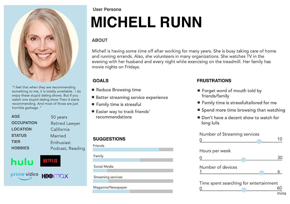
Persona
Based on the interview data I collected, I created personas. I am not a user, and I wanted to design something keeping personas in the center. Andrew Todd and Michelle Runn helped me stay focused on the users’ needs throughout the design process.

HOW MIGHT WE
I generated ideas to solve design challenges by asking specific questions starting with ‘How might we ..?’. This provided me an opportunity to design an innovative solution to these problems.
01
HMW reduce the searching time when looking for a show or a movie
02
HMW improve the availability of recommendations from family and friends?
03
HMW make users' TV watching experience more enjoyable?
04
HMW reduce the long gaps when people have nothing great to watch?
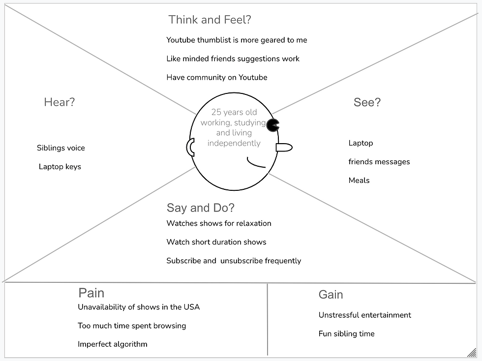
Empathy Map
I made two empathy maps for a 50 years old woman and a 25 years old young student to bridge the gap between the personas’ thinking, feeling, and doing habits.

Users' Stories
As synthesizing the data led me to define the problems, I brainstormed the tasks and flows to ideate the solutions and generated a vast array of assumptions.
I figured out that all insights can be grouped into two categories
-
How to reduce browsing time?
-
How to interact with friends and family?

The next step was visualizing users perform different tasks on the app. I listed some users' stories to articulate the functional needs and requirements for completing a task.
01
As a user, I don't want to enter my login id and password again so that it will be easy to use.
02
As a friend I want to access all my friend's recommendations so I have more options to choose from.
03
As a viewer, I want to see a detailed description of shows and movies so that I can make a better decision
04
As a user, I want to get a notification when friend recommend a show or movie so that I will stay informed.
05
As a viewer, I want to write my review about a show and movies so that I can share my experience with others.
Information Architecture
Next, for seamless navigation, I designed a blueprint of my app. I firmly believe that the way the content is organized is as important as the content itself.

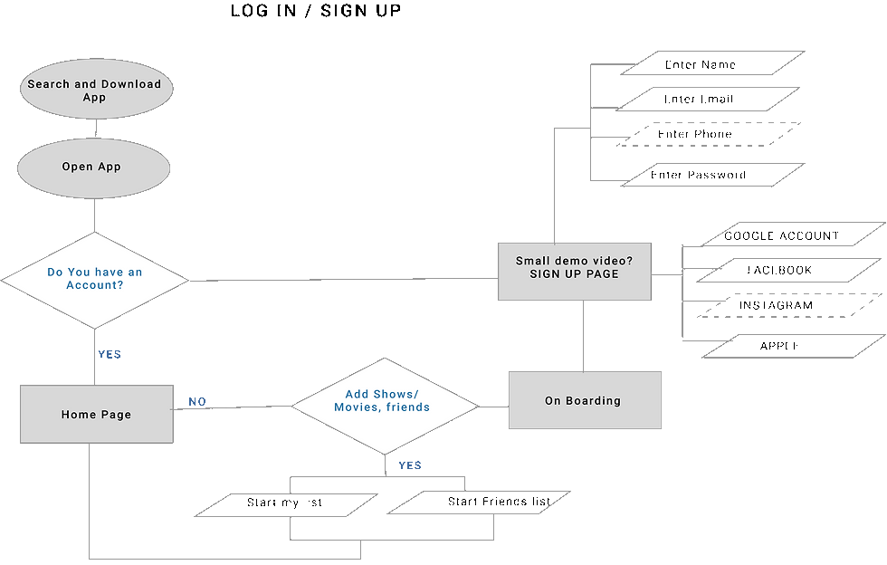
User Flow
The users’ success depends on accessing and providing good recommendations to their friends and family. Users should be able to connect, review, rate, and recommend the shows. Also, they can use the app to see what others are watching and make a small community share experiences. I draw the below most critical routes to make the app a success.


DESIGN
Sketching
Sketching the screens on paper is the quickest and cheapest way to draw lots of designs. Below are some of my initial sketches.

Guerilla Testing
Before designing further, I tested my sketches with five candidates. I made a quick prototype on Marvel and used guerilla testing techniques.
LOCATION
CANDIDATES
GOAL
Peet's Coffee
Randomly selected five people
Validate the idea and check if my assumptions are aligned with the real-world users. I asked them to perform four red routes and define the core concept of the app
KEY FINDINGS
01
‘Add friends’ and ‘watch a show’ tasks were done with minor difficulty.
02
‘Recommend a show’ was confusing, and users struggled to perform it.
03
The users' flow is very intuitive and all five participants managed to complete the task.
Low fidelity wireframes
After implementing findings from the Guerilla testing in my initial sketches, I moved forward and created a more detailed low fidelity wireframe in Sketch. I linked these screens for testing and iteration.

Design Systems
I selected colors from the logo as primary and primary dark variants. Other colors were chosen to provide contrast and accessibility.
NanumGothi worked well as it is fun, readable, and sans serif font.
I used underlined, consistent, standard, intuitive, and user-friendly icons to reduce cognitive load on users.

I wanted to have a simple but effective logo. I chose the shades of blue like sea and sky, which represent resourcefulness, trust, serenity, and confidence
Primary and secondary buttons, dropdown menus, decision buttons, top menu bars, and text search boxes were designed.
High Fidelity Prototypes

I designed a hassle-free login page where the user needs to add her phone or email once and no password to memorize. The app will send a code to verify the user, and they are set to use the app.

I designed landing page having friends recommendations, Mylist, and highly-rated items. A tab bar at bottom and search function to have a top umbrella search. More buttons to open popup windows for different actions.

The main purpose of bingr is to recommend shows and movies to friends and family. I planned various ways to recommend a show to someone.

On Bingr, the user can connect with friends and family. Send invites, add, delete, accept, and search for friends.

When searched for a friend, app will pop up results from the contact list and bingr. If the friend is not listed, in that case, the user can send an invite by email or phone.

Description of a show or movie can be seen by clicking a movie poster.

Bingr provides a solid search options
VALIDATE
Prototypes
I made prototypes in Invison for testing the functionality of the app with five users.
First Usability Testing
After developing prototypes, I wanted to find out how users interact with my product and how satisfied they are with the overall user experience. I set moderate testing sessions with magic five users. The candidates were similar to personas and were not involved in any previous interviews or testings. In the thirty-minute session, testers were observed performing different tasks and asked follow-up questions for further investigation. Below is the plan for testing.

FINDINGS USABILITY TESTINGS
Most of the candidates were able to conduct the tasks with no or minor difficulties. Their feedback and insights were allocated into minor to critical categories.
Issue #1
Accessibility issue
Font size is too small and not readable by some users.
Summary:
When an older-aged user is asked to browse through the page before starting the task, they have problems reading the bottom tab bar.
Recommendations:
-
Increase the size from 8 points to 9 points and change style to bold
-
Change background color from grey to dark grey with (50 % opacity) to merge it with the rest
-
I would prefer to have fewer pop-up windows
-
Add search on a find friends page
-
Underline clickable buttons to improve the usability
Issue #2
When asked to think aloud while checking the icons on the screen, They did not understand what task it will perform when clicked.
Summary:
When asked to browse through the page and spend some time looking at the options on the page. Some users did not notice three dots on my list and home page.
Recommendations:
Add some text next to it to make it more noticeable and understandable
Issue #3
Confused to finish the task on recommend page
Summary:
When asked to recommend multiple shows to multiple friends, some participants got confused.
Recommendations:
Improve design on the 'recommend' page
Issue #4
Primary and secondary buttons too closed
Summary:
When asked to log in, the user ended up pressing signup because the buttons are closer than the size of the mouse.
Recommendations:
Increase the padding and spacing between CTAs
Iterated high fidelity screens


CONCLUSION
Working on this project was a valuable experience for me.
I learned that as a UX researcher understanding users’ needs, motivations, and pain points is vital in creating a successful experience.
As a designer, my purpose was to construct a smooth and less complicated flow by using intuitive navigation and logical structure in the designs. I ensured that the app has accessibility as a core principle. Lastly, incorporating testing right from the beginning and until the end of the process provided an opportunity to refine the interfaces, learn more about the users, and their problems.
It is challenging to know the end product right from the beginning. My final product was evolved after many iterations from the finding from the testing. While working with the developers I figured out that some new functionalities can be added in login and recommending pages. After the handshake of the prototype to producers, I remained constantly in the loop and kept iterating the user flows and designs as needed. I learned that collaboration between technology and designers very crucial.
NEXT STEP
I am working with engineers to develop the app. The Beta version is expected to be rolled out in fall 2021.
MORE PROJECTS


